Design
Turning an iris into artwork
The prepared iris is raw material, not the product. What the client hangs on a wall is created in the design step that follows.
Short answer
Iris artwork comes down to four decisions: background, how large the iris sits in the frame, its position and rotation, and how colour and effects are handled. The starting point is an isolated iris with transparency, which can be placed and replaced without repeating the editing. Making those four decisions deliberately and consistently produces a recognisable studio style rather than a set of one-offs.
Starting point: the isolated iris
Design assumes a cleanly isolated iris on transparency. Only then can the background be exchanged without a bright rim or leftover sclera showing. How that isolation is produced, and how to spot a poor one, is in how to isolate an iris.
Finish that step before designing. Colour and effect decisions made on an uncleaned iris usually have to be made twice.
Background
The background influences the result more than any effect. Three directions work reliably:
- Black or near-black: maximum contrast, the iris glows, the classic wall-piece look
- Dark gradient or subtle texture: more depth, less severe than pure black
- Coloured background tuned to the iris: calmer and more decorative for living spaces
Common mistake
A light background is rarely a good choice for irises: the outer rim is dark, so the edge turns hard and every imperfection in the isolation becomes obvious.
Size, position and rotation
Size in frame
A frame-filling iris is striking and forgiving of nothing: every retouching flaw and any softness is visible. A smaller iris with generous space around it reads calmer and more graphic — and shows less detail.
Rule of thumb: the better the source material, the larger the iris can sit.
Position
A centred iris is symmetrical and quiet. A slightly off-centre placement creates tension and leaves room for lettering. With two irises, position is what the image says — see combining multiple irises.
Rotation
An iris has no 'correct' orientation in a design sense, but it has features: prominent crypts, brighter sectors, a distinctive area. Rotation can move those to where the eye lands first.
With two irises from the same client, aligning the rotation makes them read as a pair.
Effects, used sparingly
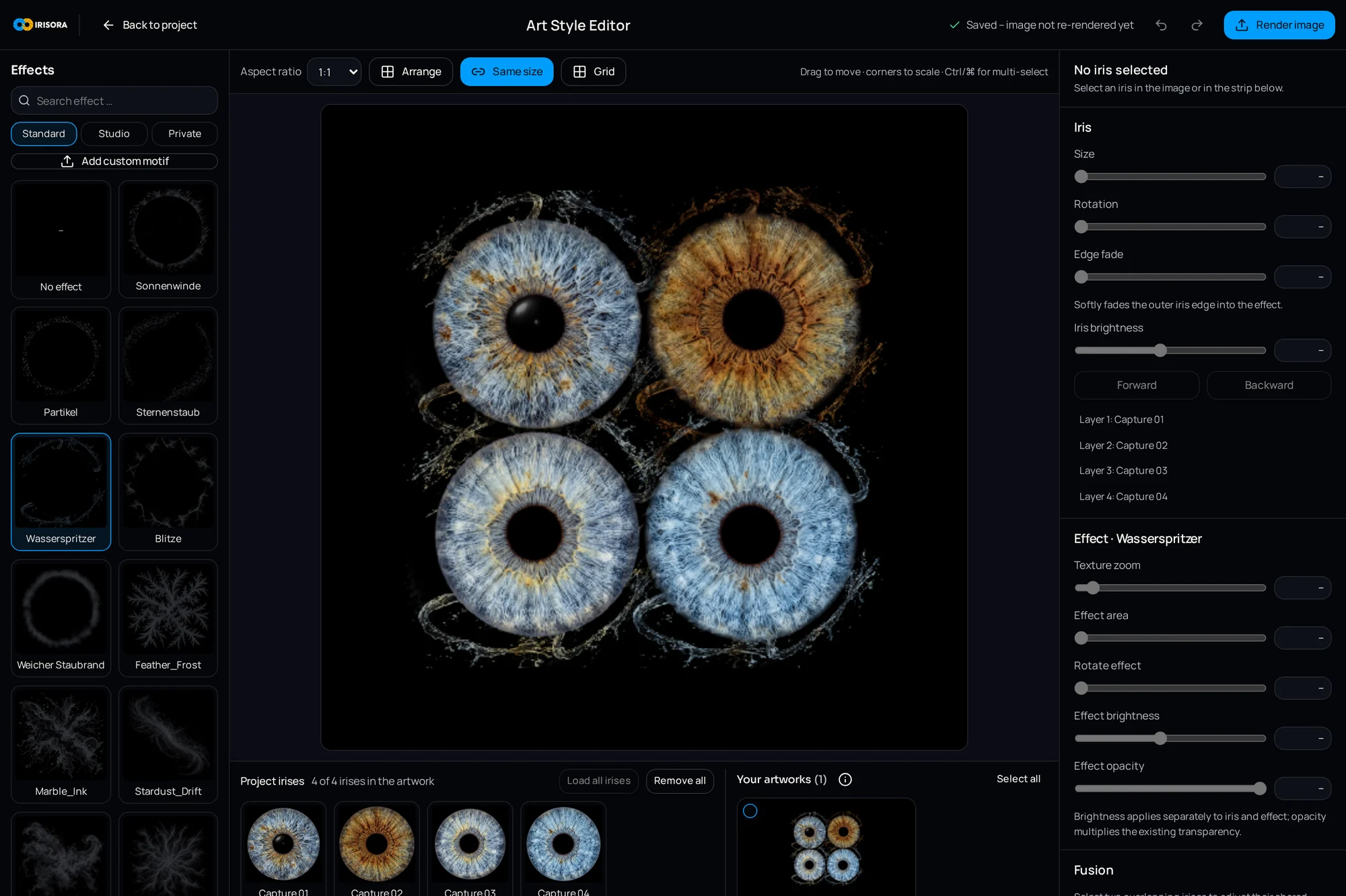
Effects should support the iris, not replace it. Used with restraint, three work well: a slight outward glow that separates the iris from the background, a subtle vignette that guides the eye, and a small contrast lift toward the centre.
It becomes a problem when effects sit on top of the structure. Strong glows eat the outer fibres, heavy textures cover the crypts, and oversaturated colour turns a portrait of an eye into a graphic. That may be intended — but it should be a choice.
Practical tip
Test every effect once at 100 percent on the iris rim. That is where it first becomes visible whether it costs structure.
Colour: natural or creative
Two legitimate routes that do not mix well. Either the image shows the client's actual eye colour, in which case the rules in keeping natural iris colours apply. Or it is a colour-designed piece where the iris supplies the form.
The awkward case is the middle: an iris that looks almost natural but clearly more saturated than the real eye. Clients notice, because they know their own eye colour. Separating the two routes in conversation — and offering both versions where appropriate — is clearer.
Text, lettering and watermarks
- Keep lettering restrained — a name, a date or initials is enough
- Leave distance to the iris rim so text does not compete with structure
- Size type for the print format, not for the screen
- Watermarks in preview files only, never in the print file
- Keep preview and print files consistently separate
A style, not an effects collection
A studio style emerges from repetition, not variety. Settling on a background family, a preferred iris size and a consistent colour treatment creates a visual language — and the next client can see why they came to this studio.
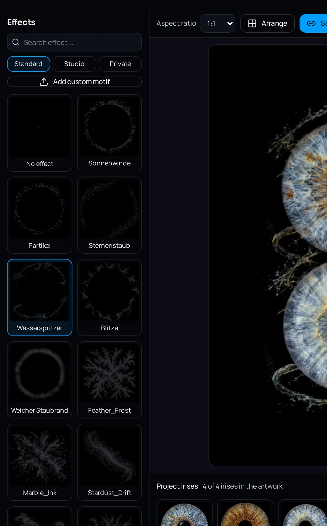
IRISORA covers this step in the art style editor: background, size, position, rotation and effects are applied to the prepared iris, and settings can be saved as a preset and carried to further irises. The prepared iris is not locked to the design — it can be used without any art style and taken into another application.
Frequently asked questions
- Which background suits light irises?
- Dark backgrounds almost always work, because they raise the contrast against a light iris. With very light blue or grey irises, a deep blue or charcoal can feel more pleasant than pure black.
- Should the pupil stay black?
- Usually yes. An even, deep pupil anchors the iris. Brightened or colour-filled pupils quickly look artificial — unless the piece is deliberately graphic.
- Can a finished design be changed later?
- If the transparent isolated iris is archived, yes: background and design can be redone without repeating the editing.
Related reading
Try the art style editor
Design a prepared iris with background, size, position and effects — and save the setting as a preset for the next client.
5 free iris edits included